Project goal
__
__
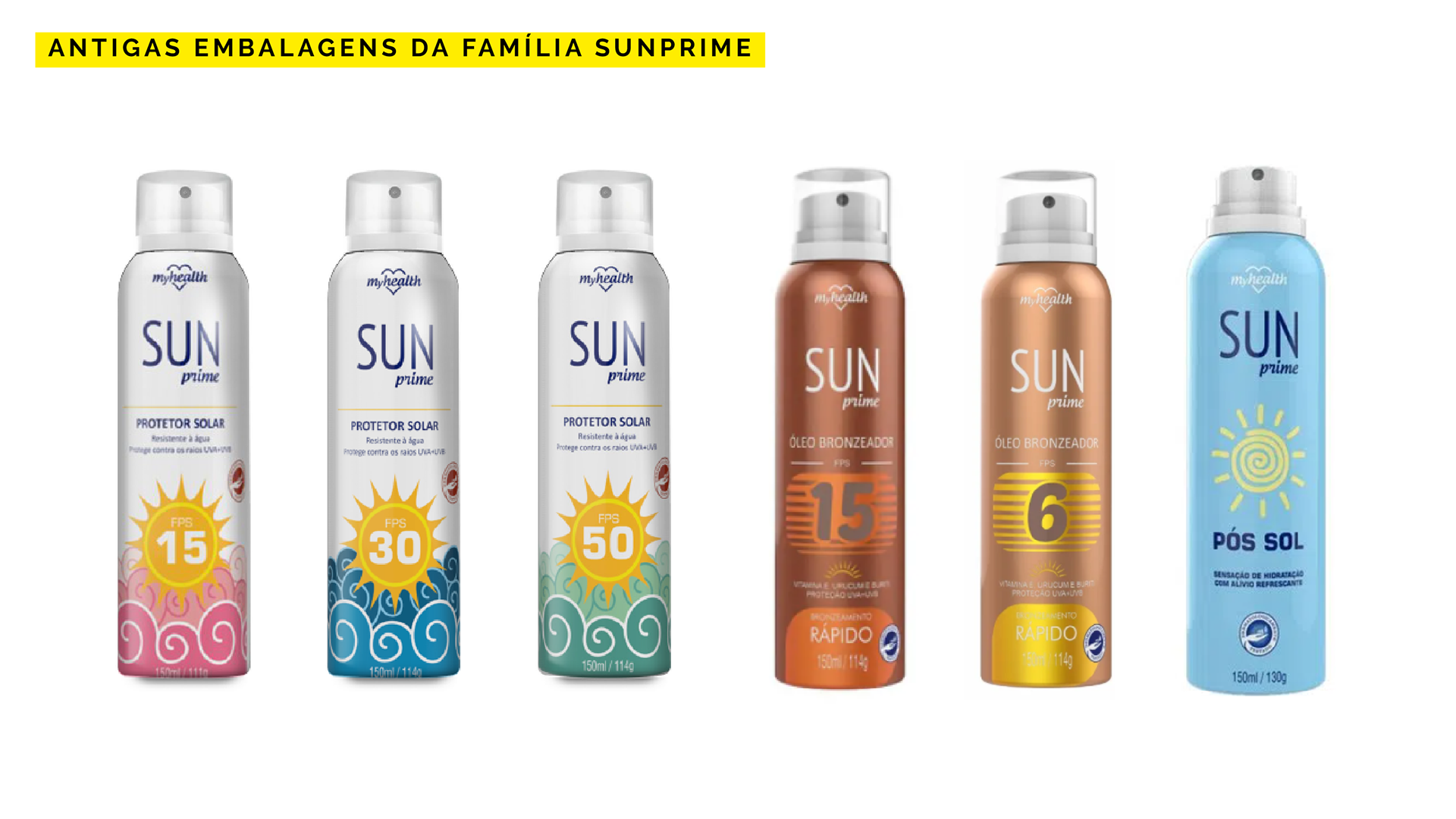
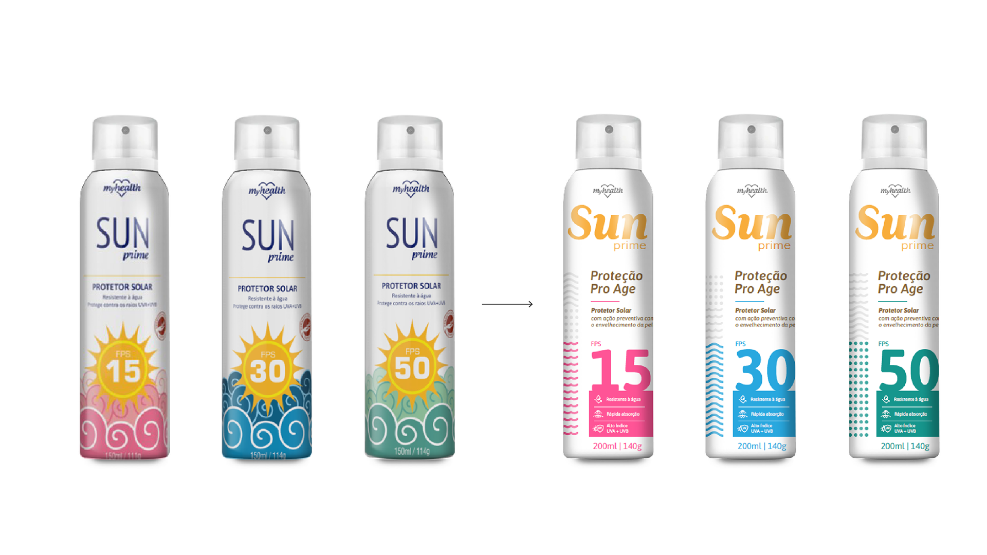
The objective of the project was to redesign Aeroflex's Sun Prime packaging line. More than just redesigning the packaging line, we worked on repositioning the brand, in order to value attributes that Sunprime has and creating a unit for the entire line, which, as you can see from the following image, there was no unity and clarity among the products of the Sun Prime family: sunscreens had one identity, tanning products another, and after-sun, another. The only common factor between the packages was the "Sun Prime" logo.
Research
__
__
The work started from a research on the positioning of competing brands and presence at the point of sale. In parallel, interviews were conducted with consumers of products covered in the survey, especially sunscreens and suntan lotions, in order to discover the valued attributes, preferences, needs, etc.
One of the main factors identified in both surveys (competition and interview with consumers) was about valuing products associated with health, having a preventive action against skin aging and conveying security that the brand is responsible and has a commitment to its consumers.
From the identified context, scenarios were created for the repositioning of the Sun Prime brand, in order to highlight it at the point of sale and bring value attributes that Sun Prime products have and that were identified in the research as relevant and differentiating.
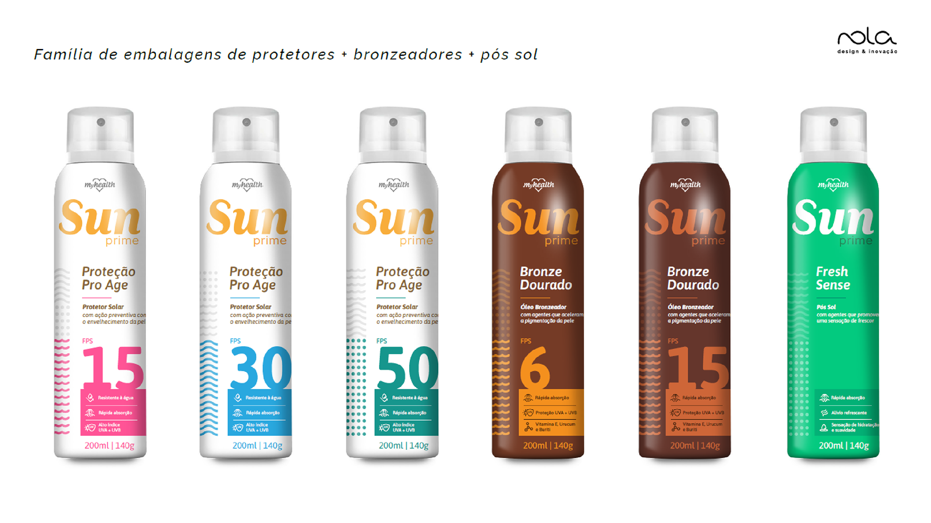
Packaging Design
__
__
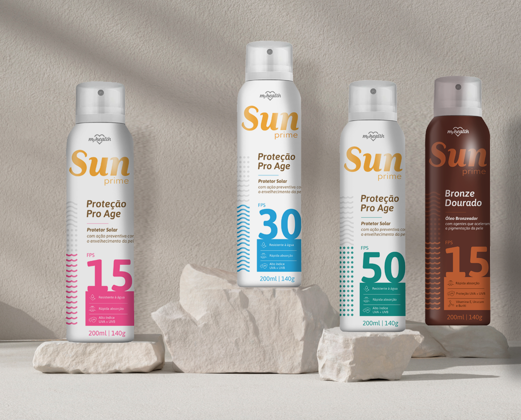
From the proposed positioning scenarios, we created a line of packaging with a very clean look, with differentiation between the different protection factors and, mainly, valuing the attributes associated with health, related to the protection factor against skin aging. To this end, we created the name "Proteção Pro Age" for sunscreens. As for suntan lotions, "Bronze Dourado" and for after-sun: "Fresh Sense".
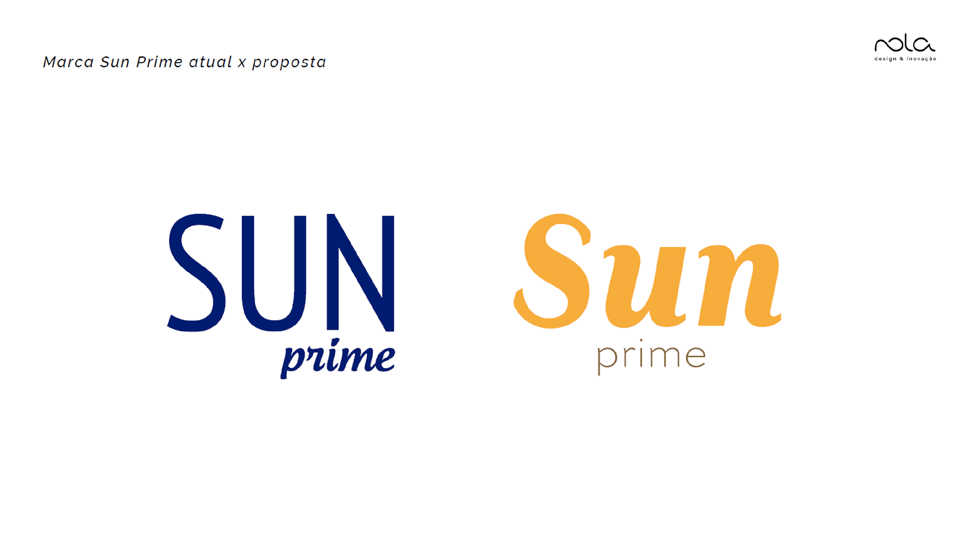
In addition, the "Sun Prime" brand was redesigned, aiming to be more fluid and more associated with "summer".
In addition, the "Sun Prime" brand was redesigned, aiming to be more fluid and more associated with "summer".

Images © 2021Nola Design & Aeroflex, all rights reserved.