Project goal
__
__
The main objective of the research was to prioritize the main information to be in the Tavascan Car World (new car from CUPRA) and achieve a content structure that can be applied universally, gathering perspectives from all stakeholders: internal, markets, and users. The objective of this is to increase conversion to online sales and test drives.
Project duration: December 2022 to February 2023.
Project realized in 14 Agency for CUPRA.
My role
__
__
● Users survey
● Design and plan workshop with internal stakeholders (internal customer team and markets)
● Conducting workshop sessions
● Analysing data from surveys and workshops
● Design reports
● Design and plan workshop with internal stakeholders (internal customer team and markets)
● Conducting workshop sessions
● Analysing data from surveys and workshops
● Design reports

Methodology
__
__
The steps of the process:
A. Heuristic evaluation
Analyse experience problems in the current CUPRA CWs and how they impact the overall user experience. The main goal was to look for gaps in the experience and judge the CWs against common usability heuristics. Evaluation based on CW from another car: CUPRA Born car.
B. Workshops with internal stakeholders & Markets
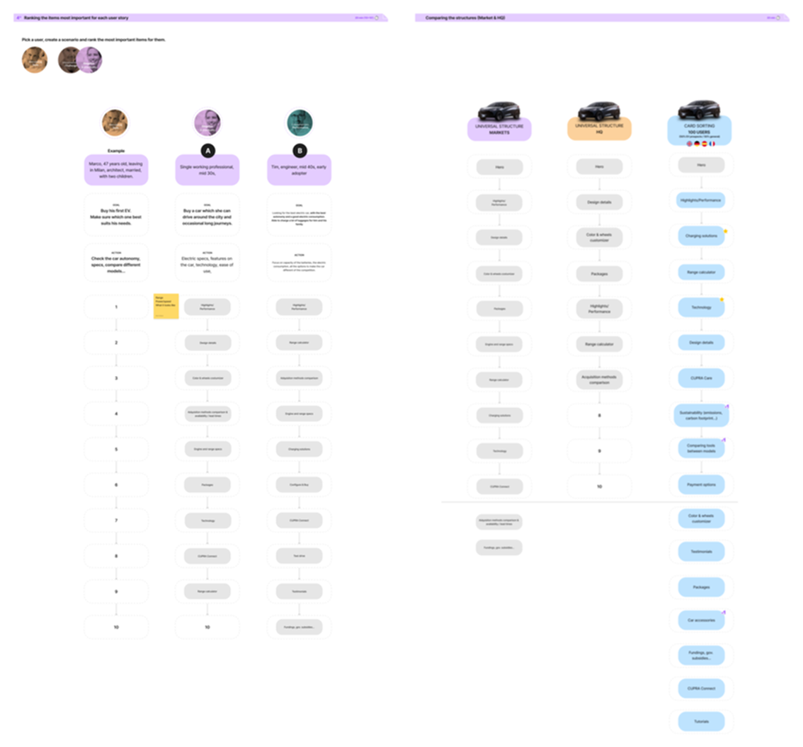
In the workshops, before proposing a universal structure, the participants, divided into groups, had to classify the 25 contents of the CW Tavascan as must, might, or discard. We created the content based on the CUPRA Born CW.
After this exercise, to propose a universal structure for the CW, workshop participants had to choose and prioritize the content to be on the CW.
After this exercise, to propose a universal structure for the CW, workshop participants had to choose and prioritize the content to be on the CW.
C. Survey with users
For the users, to prioritize the information, we asked users: “What information would be useful on the description product page for an Electric Vehicle?” showing the same contents that we presented in the workshops.
For the users, to prioritize the information, we asked users: “What information would be useful on the description product page for an Electric Vehicle?” showing the same contents that we presented in the workshops.

The image has been intentionally blurred to protect the confidentiality of information.
The research process
__
__
A. Heuristic evaluation
From the Heuristic evaluation, we identified some pains points:
● Navigation: The navigation is not simple, so the users cannot reach their goals in an efficient and effective way. The main navigation does not indicate where people are on the path. So, breadcrumbs could be a good option to guide users. Users do not have straightforward navigation so they could feel lost in the middle of the task.
● Content: There is too much information. We should ensure that the visual elements of the interface support the user's primary goals. Lack of consistency through the country websites. Information hierarchy is different in every country.
● Design & Layout: The website does not appear clear, easy, and intuitive to use. When someone lands on the page, there is no clear visual starting point and where they need to click, where they need to scroll. No clear back options.
B. Workshops with internal stakeholders & Markets
In the workshops, before proposing a universal structure, the participants, divided into groups, had to classify the 25 contents of the CW Tavascan as must, might, or discard. We created the content based on the CUPRA Born CW.
After this exercise, to propose a universal structure for the CW, workshop participants had to choose and prioritize the content to be on the CW.
After this exercise, to propose a universal structure for the CW, workshop participants had to choose and prioritize the content to be on the CW.
C. Survey with users
For users, to prioritize the information, we asked users: “What information would be useful on the description product page for an Electric Vehicle?” showing the same contents that we presented in the workshops.
The image has been intentionally blurred to protect the confidentiality of information.
Learnings
__
__
By analyzing the results obtained from the heuristic analysis, workshops, and user surveys, we were able to identify:
● The website does not appear clear, easy, and intuitive to use. Lack of consistency and too long/ crowded CWs are the main concerns agreed upon by all stakeholders and analysis (Heuristics) is to be improved in the next CUPRA Tavascan CW.
● Of the 25 contents shown to participants, both in workshops and in Survey, 6 of them were prioritized by all.
● CUPRA Tavascan CW needs to balance emotional & rational information to be aligned with the brand mood but give at the same time the expected information to the user.
● Two different approaches arise through the activities: Business stakeholders prioritize brand and added value sections but for users, the product page should be more information oriented.